New Rug Leads To Some More Hard Decisions

My life is so hard.

We just found the perfect rug for the laundry room… and that forced me to make some hard, life-altering decisions. But now I look back on it and realize that it was the best thing to ever happen to me.

Okay, enough with the silliness. LOOK AT MY NEW RUG! YAYYY

IMG_3999

The rug is from Urban Outfitters. I really enjoy their rug selection – the rugs are always well-designed and reasonably priced. I’ve been checking their website constantly, hoping for a suitable rug for either the laundry room or the green bathroom.

I was really thrilled to find this rug – the colors are PERFECT for the laundry room.

IMG_4000

The blue on the rug is a CLOSE match to our walls… it’s basically a shade darker of the same color. It’s serendipity, I tell you.

And the dark gray… you know it. Goes perfectly with our dark gray cabinets.

IMG_3184

I’m frustrated that I can’t get a photo showing both the rug and the cabinets. Close your eyes and visualize the previous two photos on top of each other. That’s what my laundry room looks like! YAYYY

Of course, a new purchase for the house ALWAYS leads to more decisions that we need to make. I’ve been thinking about choosing fabrics for the laundry room for a while, but wanted to wait until we got a rug because it’s easier to find fabrics to go with a rug than to find a rug to go with fabric choices.

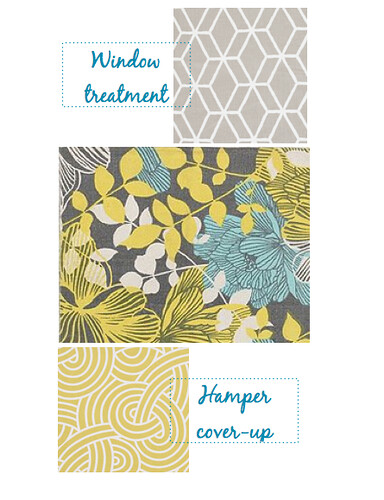
For now, I needed to find two fabrics for these two purposes:

fabric locations laundry room

I just went straight to Tonic Living, because I really like their fabric selection. There are many other online fabric shops, but they have SO MANY FABRIC CHOICES that it’s easy to get overwhelmed at these sites.

I still got overwhelmed at Tonic Living with all the great fabrics, so I just narrowed it down and down until I had several choices. Then I put them all around a photo of my rug. I used the Pages application for this step.

fabric dump

clockwise from bottom left: 1, 2, 3, 4, 5, 6, 7, 8, 9

As you can see, I also put a dark gray background at the top and a light blue background at the bottom to see how the fabrics would look with our two main colors in the room.

Then I chose my four favorite fabrics and played with them:

fabric choices 1

fabric choices 2

I really like both choices, but I liked the second one slightly better. I did a mock-up of the whole room in Pages just to see how everything would look together, along with some more additions to the room that we’ll make in the coming weeks.

laundry room design 1

This really helped me visualize the room. I played around with all kinds of fabrics, colors on the shelf, the colors for the shelf itself and the folding counter, the hanging bar, etc etc. I finally landed on this design and it has been NICK APPROVED. YAYYY

I just had to torture myself some more and do the other side, too:

laundry room design 2

That little door with the hole in it will house our cats’ fancy litter box. The design isn’t final yet – it all depends on Nick’s progress there and what he figures out as he goes along. That part will be his project.

After all of this hard work, I feel an odd sense of peace. The path has been set – we just need to walk it. YAYYY

I’ll order the fabric samples just to make sure they look good in person ($1 each at Tonic Living) and continue trying to figure out a lighting solution for the room. I’m leaning towards buying a metal pendant from a big box store and spray painting it yellow.

I’ll be back on Thursday to show you another little addition to the laundry room! We gotta hang it up first (that’s a hint). YAYYY

Plan for Guest Bedroom Finalized! Now I can sleep…

Last night, while I was in bed and hoping that Janella would make the transition to the crib successfully (she did! yay!), I decided to formulate some kind of plan for the guest bedroom.

Why now? Aren’t we focusing on the laundry room?

Yes, but the cabinet painting is taking forever (I can only get an hour or two every night, but only if Nick gets home early and doesn’t have any work to complete at home) and I feel like I’m not productive, even if I’m making progress, because it ISN’T DONE YET.

Making plans — now that’s very productive. At least, it is to me. So, that’s what I did last night.

Instead of just showing you my plans and walking away, I’m going to take you through the process of planning. I’m not a interior designer (dream job!), but this is a good way to see how a few pictures of inspiration can really help you get ideas for a room design.

Here we go.

The Room:

Sorry for the bad picture. It’s hard to take a good photo when the light is so strong and when I took this, the roller shade wasn’t in yet.

The Process:

I just opened Pages on a whim and wanted to see if I could make an image that resembled my guest room using shapes like squares, triangles, and circles…

guest bedroom 1

Not half bad. It’s not Photoshop, but it works in giving me a nice visualization of the room.

I originally thought I wanted to paint the nightstands white and add white curtains, but this photo made me go BLAH. Too much white.

I went over to my Pinterest and looked at this duvet, which I really love but won’t buy:

amazon

I had pinned the image to help inspire the room. So I looked hard at the colors. I already had the yellow in the lamps and the blue on the walls, but the kelly blue on the walls is much darker than the light blue color in this duvet.

I thought of the light blue paint we used in the laundry room… maybe that would work on the roller shade? Maybe stripes of light blue?

Not bad. But these nightstands are killing me. They are SO BORING.

Looking at the duvet again, I thought about painting them a coral color. Really? Coral? Would that work?

I LOVE IT. Okay… coral it is. Never mind it’s a trendy color and might turn into the avocado green of the ’70s by next year. Besides, I really love avocado. Eating it, I mean.

Then I was stuck again. And I didn’t really dig the roller shade plan. The color was still not 100% right.

Back to my Pinterest board, where I found this image that I pinned because the wall color reminded me of the guest bedroom.

brynalexandra

I love how the green pops against the dark blue wall.

Green? Green!

I like it so much better.

But now I’m not sure about the stripes. I know Nick’s not a big fan of stripes and even though I love stripes, I wanted something a bit more unexpected.

I looked at the above image again… and was inspired by the floor pattern. Maybe it would look good on the shade?

Eh, not bad, but not quite there.

How about this?

Yes, I like it!

Great. Great. Okay… what’s next? Oh yes – I had planned to add two frames on both sides of the window and put my hippie cloth tarp thing that I’ve held on since college. The colors in it is really pretty and it’s free.

I didn’t have a photo on hand, so I just googled “hippie sarong” and found this fabric. Close enough…

But it doesn’t mesh with the coral nightstands and the roller shade. Everything kind of felt preppy and the hippie feel in the frames just didn’t work.

Oh! What about black swirly art that I posted about a while ago and was thinking maybe doing for the living room? What if I did them for the guest room instead?

Better than the hippie art, but not quite right, either. The lines on the shade is pretty severe, so I needed the art to be softer. And maybe colorful too, since everything else in the room so far is just one color.

Soft… colorful… Flowers?

Of course, it couldn’t be boring flowers. Nick would never approve.

I immediately thought of this photo that had popped up in my Pinterest feed (do you call it a feed? the pins that you get from those you follow… is that a feed?) that I admired but didn’t pin:

design sponge

I went back to Pinterest, found the painting, and pinned it.

And added it to the frames:

guest bedroom mockup

Yes.

I’ll work on this room probably in 2013, but it feels so good to have a clear plan for it that I love!

What about you — what’s your process when you design a room? Do you use inspiration images or are you a design genius with 1,323,743 ideas in your pretty little head?

Some Free Labor For You… for Labor Day

Hi. Hope you’re having an awesome Labor Day! Just popping in to show you my completed symmetry art.

Love them, especially after my hard work cleaning up all the edges…

Yes, that’s an extreme close-up of the blue dolphin art and I’m cleaning up the edges here. So glad that’s over!

All that hard work and then the art will just hang out in our laundry room? Hmm. I thought I would give them to you, if you want them! They’re attached here and if you want to change their colors, you can just put them in Photoshop and make your changes. Enjoy!

(They’re not perfect, but when something’s free, it’s always perfect.)

orange dove 

blue dolphin

yellow deer

green goose

Symmetry is Hard

This morning I finally sat down and began working on the DIY art for our laundry room.

from Room & Board, but they have different images now

As with all of the projects we do around here, it took longer than I thought it would. I think I should start purposely overestimating the time it takes me to complete a project so I feel proud when I finish earlier than expected instead of feeling like a ol’ turtle. A turtle with only one arm.

First, I stared hard at the photo above. And then I tried my best at drawing the “original” shape of each artwork. You can see here that some of the images are copied and flipped to one side and some are copied and flipped three times to make four images in one. I drew the shapes freehand and then scanned them.

I actually drew shapes for all of these four images, but I ended up working on only one for the next… hour. I chose to focus on the orange “dolphin”” image. Can you identify all the animals that are represented in the shapes? This art is so cool.

I scanned the images…

I put my scanned drawing into Photoshop and copied and flipped the image. Sadly, the resulting image wasn’t good because the head and the tail were too close to each other and it just looked all smushed up. So I cut up the drawing into three pieces (the head, the tail, and the… fin?)  and moved the pieces farther apart. I then used my mad Photoshop skills to draw lines to connect the three parts.

Wow, what a beautiful job! Someone should hire me to do this for a living. I have a slight excuse for the seizure-like orange lines – I don’t have a mouse. But I drew these lines with abandon in Photoshop because I knew I had a solution:

I just printed out my amateur Photoshop image and then traced smooth lines on another piece of paper. I embellished on some of the areas, making the fins and the head a little bigger and longer and leaner.

Scan. Open in Photoshop. Copy. Flip. Play. Result?


Looks much better than smushed up dolphins, but not perfect yet. I looked at my traced dolphin again with an eagle eye and changed the parts that didn’t look right. Bigger dorsal fin, please. A thicker head for a thicker brain. Don’t make the fin so long – erase, erase, draw.

Scan. Open in Photoshop. Copy. Flip. Play. Result?

I like it! I think I might adjust it just a teeny tiny little bit more, because I like to torture myself, but it’s pretty much ready to be blown up on a big piece of paper via a projector. I hope to get to do that very soon.

The blue Photoshop paint is just to help me better see what the image would look when painted, if you were wondering. I have no idea what color the dolphin will be in the end – it all depends on what colors we decide on for the laundry room.

I want to do the other three images so I can select the best two out of four, but let’s see if I can find the time to do that!

In other news…

Laundry Room Brainstorming

Can you believe we’ve got only two rooms left in this house to paint? We’ve already decided on the paint color for our master bathroom, so all that’s left (other than the closets in the house that we’ll eventually tackle) is the laundry room! Here it is in its current and boring state.

It was really hard finding inspiration for this room. We knew we wanted light colored walls (light blue? light teal?) and possibly stripes on the long wall on the left (Nick is still eh on that idea), but what else? I’m still struggling with putting together a plan for the room, but here’s what we know we want so far.

I found the color scheme from Pinterest – it’s very closet to what we had in mind for the room. Light blue/teal, yellow, dark gray, white, darker blue/teal. I love this light from BoConcept, but not the price – I want to find a simple hanging light from Craig’s List or Restore and spray it a fun yellow. I already showed you the cabinets we’re going to paint dark gray, and we’re considering using the same knobs in our 1st floor bathroom just because they’re so pretty, but probably simple crystal ones from Hobby Lobby will do.

And that’s as far as I got. I really couldn’t find a paint color that we loved or a fabric that made us go YES! We can hold off on fabric decisions, but I really don’t want to do anything in that room before we paint the walls.

We thought maybe light blue would look good… until this (horrible as usual) photoshop mockup.

And now we’re just not sure. (Ignore the white board and the fabric for now, I’ll get to that later) Is the blue too blue? Too… pastel-y?

I tried this color:

Slightly better, I think? I have a feeling we’ll go through 32 samples before we come to a decision. I think we really need to find a fabric or a piece of art that just speaks to us and gives us inspiration and then we can go from there.

Okay, now the white board – I am thinking about getting a piece of plywood and painting it white and just sticking it on the top of our laundry machines so we have a clean space to fold our clothes on (similar to this). But since we don’t have fancy front-loading machines, we could cut the board up into three pieces and add hinges so we can just pull one side up to load the washing machine (on the right) and then pull the other side up to clean the lint filter (left side). Now that I’m really thinking about it, would white be a wise choice? Would it look dirty too fast from lint and laundry soap and general laundry messiness? Argh.

The fabric is a fabric that I really liked at JoAnn’s, but I’m not sure if it will work in this room. But let me tell you why we want fabric there. We have two whale-sized big cats that demand a big litter box. We kept on upgrading and upgrading to bigger ones, but I think we need an even bigger one. Sigh. Our house is not that big, cats. Stop being so demanding. And we tried putting the litter box in many different places in our house and none of them is working. Our last solution is in the laundry room, but we want to keep the room clean… so I’m thinking about hacking a litter box to get it to fit in the space between the machines and then adding little fabric curtains that covers everything up – the machines and the litter box. But the curtains would be in two pieces, so it would be easy to push them around. Did any of this make sense?

Moving on… I think this would be a fun idea for art for me to DIY for the laundry room:

Yep, I mentioned it before in my post about art that were diy-able. I think I have an idea of how to do this – with the help of a scanner and Photoshop and a overhead projector. Alas, I only have a few days left for my Photoshop free trial, so I’d better get hustling on this one.

So, that’s where we are with the laundry room. But I feel stuck… I need a paint color!

Black swirlies, strokes, dashes, lines, etc.

A while back, I posted about DIY art ideas. I think I’ve finally decided on an art project that I want to do for the space above our sofa.

Something like these:

lonny

via my favorite and my best

Elle Decor via i suwannee

Ralph Lauren Home via Colour me Happy

And I love how the art in the below picture is divided into two separate frames:

via Trouvais via From the Right Bank

Here’s my vision. Three frames from Ikea, some black paint, and a steady but dancing hand. Should be easy, right?

Uhh… I might have to do 100 tries and go through 43 buckets of black paint before I get it right.

Nick joined in the fun and made this one:

Sometimes he thinks he’s so clever…

Bathroom lighting: ideas, choices, and indecision

Now that I’ve bought the mirror and the whale art, and the rug, shower curtain, and knobs are on their way to my house, the next thing on my mind for our bathroom revamp is… well if you’ve read the title, you already know. Lighting.

Our current lights:

This is actually from our master bathroom, but you get the idea. Gorgeous, it is not. Our first floor bathroom is just like this, but with three bulbs.

I would LOVE to put in scones…

via lonnymag.com

…or a ceiling light…

…but I don’t feel like calling an electrician just yet, so we’ll stick with a wall light.

I like the clean look of the lights in this photo:

via The Estate of Things

Some options we’re considering:

via Lights Fantastic

via Lights Fantastic


via Lights Fantastic

All of these come in two lights or three lights. I’m not sure which we should go for, two or three? What do you think?

Just for funsies, here’s another animated GIF to see it all in action.

I’m still not sure… Do you have any better ideas for bathroom lighting?

All lights are from Lights Fantastic –  because there’s a store in Austin and there’s a great coupon that I plan to print out and use, if we buy from them. Find the coupon here, if you’re near Austin or Dallas!

Black & White Rugs

Our beige and ratty and cheap and cat-destroyed carpet does not look good next to to our new roman shades. Since we can’t get wood flooring right this second, I’m on the lookout for a great rug.

I started my search with black and white rugs. Neutral, striking, and (insert adjective here), they would look good with a white coffee table.

First up – the ubiquitous striped rug from IKEA:

Yes, you’ve seen this everywhere in blogland. And for good reason. It’s great-looking and at a great price.

Here’s one, that’s similar to the IKEA rug, but simpler…

…and more expensive. Still, I like it.

A while back, Raina from If the Lampshade Fits blogged about this, as she would say, delicious cowhide rug:

Unfortunately, it’s sold out, but I emailed them a while back asking if they could do it in gray and black and they said they could do it in any color. So, maybe they would be willing to make another one if I email them again?

Another rug with a diamond pattern, from West Elm:

Nice. It’s a casual look, very comfy and cozy.

A bit refined version of the diamond pattern rug can be found at Dash and Albert:

I think I like this version a little better. The white is more white.

Not done with diamonds yet, dear Reader. This one’s from Overstock:

Well, it’s more like a hexagon pattern.

What about this one, also from Overstock?

It looked sooo beautiful in Laura’s shed. I never knew a shed could be beautiful.

This one is sassy. Not sure if it would work in my living room but maybe yours?

And this one, just for fun, because apparently plaids are in.

It could be really cute in the right room. I think?

Should I tone it down on the patterns due to the window shades… and add a touch of yellow to our rug, because we want to bring in more yellow to relate with our dining room accent wall? Something like this:

Maybe I should look into yellow rugs…….. Later.

For now, here’s an animated GIF to visualize all this! My first animated GIF… ever. It seems like you have to click it to see it in action. (Not all of the above rugs are in this GIF)

Looks like a rug with a strong pattern won’t work. This took time to make, but much cheaper than buying the wrong rug! I do like the last rug, though.

Why didn’t I get my mom’s genes?

Here is my mommies. With her husband, Jose.

Doesn’t the Pictionary Man have the cutest butt?

Through the miracle of birth and genes, I got my gorgeous mom’s smile, tiny forehead, and freckles. Unfortunately, I didn’t get her height (she’s almost 5’8, I’m barely 5’4), her red curly hair, and her productive energy.

See what she did to her house she recently bought…

Before:

After:

YES.

But she wasn’t done. She also painted the front door:

Before she began painting, I begged her to PLEASE PAINT IT GRAY. And then she said she might do it! So I played with photoshop and got this:

BLAHHH. She and Jose went ahead with their original choice of yellow and I love her current yellow house so much more. I guess sometimes gray isn’t the best color! Who knew?

Love you mom, miss you, wish you lived a bit closer!

Serious Dilemma: The Windows

Seriously, now. Come on, now. Enough.

I’ve been hemming and hawing over them stupid windows in the living room and the dining room. Am I going to let four windows break me?

We’re still living with ridiculous white plastic blinds, now all destroyed by our then-kittens, and STILL slummin’ it with a cardboard cover on one window.

We found fabrics we liked for our planned DIY window shades, but we were paralyzed because our DIY window shade wasn’t holding up very well. We weren’t going to purchase expensive fabric for a bunch of droopy window shades. Then I found this great tutorial (can’t find it now) about how to glue fabric to a white roman shade, but it is a big risk. Fabric is expensive and I don’t know how long this would last.

We then thought, maybe, let’s do the bamboo blind and white curtain combo? Very popular in blogland and a classic look.

Did the math and it came to around 388 dollars for plain blinds and white curtains. Hmm.

Played around with a photo from Overstock – added the gray walls, removed the white trim from the windows.

I could use patterned curtains, like these curtains I really like from West Elm:

I dunno about this look. Remember, I’ve been thinking about this for MONTHS so my judgment is seriously flawed. Tell me what you think. I just am not sure if it would work in our home.

Then I saw this picture at MFAMB:

This elicited a LOVE!! reaction from me that bamboo blinds and white curtains just never did.

And Nick says NO MORE DIY PROJECTS BECAUSE YOU NEVER COMPLETE ANYTHING. I told him, it’s going to be expensive to not DIY it. He said FINEEEEEEE.

I am going to remember this trick.

So, I am currently researching our options. I think we want patterned flat roman shades – something geometric or Moroccan, something like in the picture above – in white and gray.

It’s been hard finding sources. Why?

So far, the best thing I’ve found is this:

From the Shade Store.

Calico Counters also does custom roman shades, but I haven’t seen any fabrics there that I love for this purpose. I emailed a few fabric stores asking for price quotes. Do you know of any other custom roman shade sources?

I just can’t stand looking at destroyed versions of this any longer. It’s serious. If you do a google image search of “destroyed plastic blinds” the first picture you get is OUR WINDOW BLINDS! Evidence below.

Oh my gosh. That fourth picture looks familiar, too…